We all know those statistics about mobile use… how it accounts for approximately 55% of all web traffic (that was in 2021 – it could be even more now!). And Google cares about this a lot when determining its search rankings for your Kajabi website. So you should care too!
This means that you need your mobile site to be on point. Sure, it may not be as pretty as your desktop site, but it should at least have all the same information plus some visual interest.
How to Create a Mobile-Friendly Kajabi Website
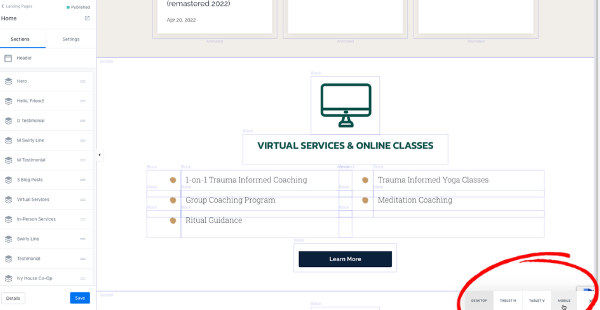
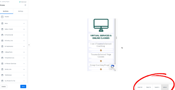
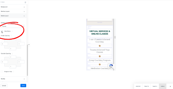
Once your page is designed, click the little triangle in the bottom right corner and select “mobile.” This is how you’ll see the mobile view of your current design.
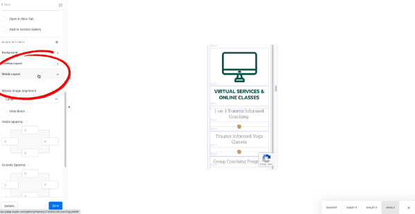
Click on any block that looks funky, and make adjustments using the “mobile layout” section in the page designer on the left side of your screen. This might involve changing the spacing, making something center-justified instead of left, or hiding it on mobile altogether if it’s unnecessary and hurts your eyes.
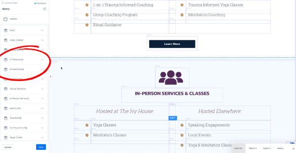
You may find sections that just don’t look right no matter what you do to them. In this case, it’s probably best to re-create those sections specifically for mobile. To do this, duplicate the section so you have two identical sections. Click into the settings for one section and hide the entire section on Mobile. Then hide the other on Desktop. Now go ahead and make as many changes as you need to the one hidden on desktop without worrying about it ruining the look of your site.
When I create two sections like this (one for mobile and one for desktop), I like to rename them with D and M at the beginning so it’s easy to tell which is which when you’re making edits in the future.
Lastly, once you’ve published your Kajabi website page, make sure to check the page on multiple different-sized screens (desktop, laptop, tablet, and phone) so you can see how it works in real life.
If you need help with the design of your site, hit me up!